
Top Ten Worst Website Mistakes:
In honour of our 'Worst Website Contest'
1. What is this Website Even About?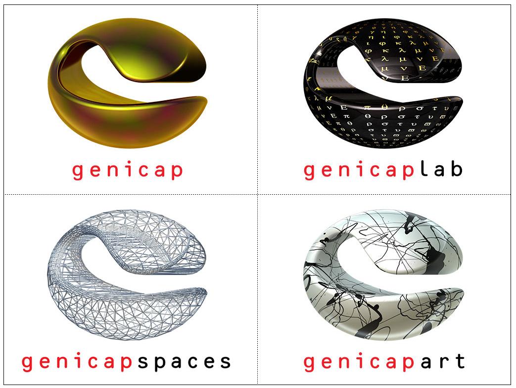
For example: http://www.genicap.com/Site/
2. Getting in the Way of a Sale
When a visitor decides they want to buy, contact you or register for your offering, they better be able to do so easily! This means having what are called 'Conversion' elements available on all pages. The last thing you want to do is lose a sale after you've already 'Converted'.
Click for more information on Conversion:
http://www.fp-imarketing.com/calgary-internet-marketing/conversion-review.html
3. Thinking your Website is your Marketing Strategy
Understanding that your website is only PART of your Marketing strategy is the first step. Next you need to figure out where your website actually fits into your strategy. Look through the other marketing channels such as radio, search engine marketing, social media, or print to see what makes sense for your strategy and come up with an implementation plan.
4. What's Content?
One of the most important elements on your website is the content. This isn't just for the visitors convenience but is also a large factor in search engine optimization. The best content strategy you can implement is frequent updated content, keep posts regular and content updated. Even if you lack website design, content can be a driving factor in return visitors. Don't underestimate content importance.
5. Too Much Material:
Okay, don't take number 4 too seriously. it doesn't mean you need to load the content all on one page. Too much content scares visitors. Break up your material into separate and relevant pages so visitors don't get overwhelmed and can find the content they're looking for directly instead of having to read it all to get their information.
6. Navigational Failure
Alright, this one's pretty simple, but it seems like some people still don't understand. Navigation must be simple and consistent so visitors can get around on your website. This isn't an element where you should be taking design liberties, keep it simple. Think about your customers and their needs first and design the navigation for ease.
Check out this Navigational Failure with about 30 options on the first page:
http://www.chestertourist.com/morehotels.htm
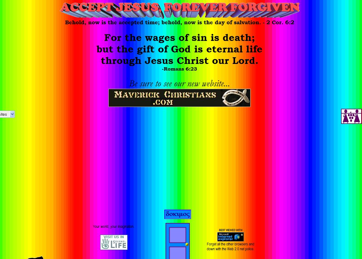
7. Website Design
After you've created an easy to navigate, conversion based website with relevant and updated content, you need to think about visual appeal. Look at other websites to get a better idea of acceptable design.
Here's an extreme example of what not to do:
http://www.dokimos.org/ajff/
8. Contrast! Contrast! Contrast!
Most importantly make sure there's a contract between your background and the text color, so visitors can easily read it. Not much point in the content it if's unreadable. However, it's also important to understand the contract of colors in your website. Obviously the website above is a horrible example of this, so below we've provided an example of contrast used well:
http://www.fixieconsulting.com/
9. Substituting Graphics for Text
although it may seem like a minor detail, but by putting graphics where text should be you're doing a huge disservice to your search engine optimization. Search engine's can't identify graphics, they only locate text. This is especially important for any promotions or products.
10. Finally, the absolute WORST mistake you could make:
NOT ENTERING our 'WORST WEBSITE CONTEST'
 With $5,000 towards a new website up for grabs what do you have to lose by entering your website? All entries are kept anonymous, and maybe you'll actually win! Thinking you've seen worse websites? Well our criteria isn't solely on the visual design. As you've learned from this post there's more important elements we're judging which is largely based on the traffic your website receives, search engine optimization efforts, content and much more.
So what's the harm in entering?
http://www.fp-imarketing.com/worst-website-contest.html#.UDzhIaDhf5w
Labels: Google, Marketing strategy, Promotion, search engine optimization, Web design, Web Design and Development, Web search engine, Website
posted by Christy Fraser @ 8:26 AM
0 Comments
![]()
![]()
![]()
![]()
![]()
![]()
![]()
![]()
![]()
![]()
![]()

Post a Comment